Placing ads on websites and blogs is a popular way to earn money. Many website/blog owners are using Google AdSense, Chitika, Bidvertiser, and other advertising networks to display ads on their websites. They also use static banners from various affiliates. Traffic is the single most important factor for generating revenue. If you don’t have visitors for your website and blog there are no questions of clicks which is the key to earning money in any way. Good traffic depends on quality content and SEO. Here I assume that there is sufficient traffic to the website/blog but the publisher is not able to motivate their visitors to click on ads. Clicks are the key to generating revenue. There are two main reasons for fewer clicks – first is inappropriate ads and second is the wrong placement of the ads. Inappropriate means not matching with the contents of the website. When you display ads from well-established advertising networks like Google AdSense and Chitika, who has a comprehensive list of advertisers, then the question of inappropriate ads does not arise. Therefore placement of ads is very important.
Ads may come in contextual, image, or video format. Whatever the form, the widely used sizes of these ads are listed below.
- Leaderboard (728 x 90)
- Banner (468 x 60)
- Half Banner (234×60)
- Button (125×125)
- Skyscraper (120×600)
- Wide Skyscraper (160×600)
- Small Rectangle (180×150)
- Vertical Banner (120 x 240)
- Small Square (200 x 200)
- Square (250 x 250)
- Medium Rectangle (300 x 250)
- Large Rectangle (336 x 280)
Placement of above-sized ads on your website is very important. You should add the required code in the main HTML/CSS file to streamline the appearance of ads there without doing any additional work. However, you can add these ads at any place wherever you want. There are limitations on the number of ads that can appear on a single page (please refer to your advertising network guidelines). Google AdSense allows a maximum of 3 contextual ads per page. Placing the ads is not the only thing you should worry about. It should be placed in the appropriate place. It should come as part of your website/blog content. Following are the proven places to add “ad blocks” having revenue generation potential.
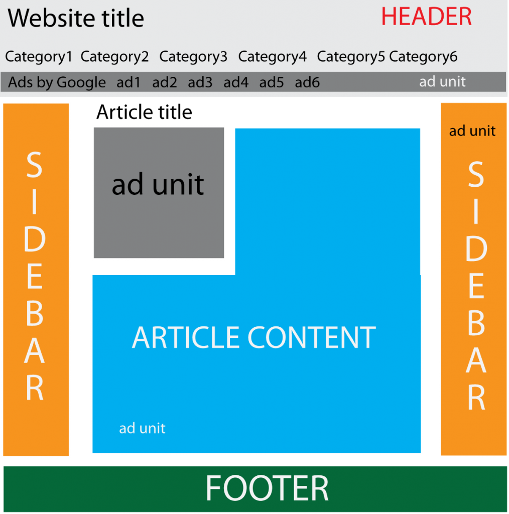
1) Top of the website
2) Sidebars
3) Start and end of the post/article
4) Middle of the article
A sample of good placement of ad blocks is shown in the following figure.

Although the placement of ads in above mentioned places has proven value, one shoe never fits all feet. There is no single formula for success for everybody. You should always try experimenting with different locations. If some ad block is not getting sufficient clicks, you should try other locations. There is no use in wasting time continuing the wrong locations. All advertising networks provide the option to put a label on a particular ad unit which is embedded in the code. So you can easily track which place of your ad is getting more clicks. Regularly monitor the progress and do the needful subsequently. Ways to add labels in ad codes are discussed in another article.
- Discover Your Home’s Hidden Wealth: Elevate Your Financial Future! - October 2, 2024
- Mortgage Insurance Exposed: How to Identify and Lower Hidden Costs - October 2, 2024
- The Real Cost of Mortgage Insurance Premiums: What You Need to Know - October 2, 2024